How to Build a Lead Magnet Landing Page That Grabs Emails Like Crazy
Introduction: The #1 Mistake Killing Your Lead Magnet (And How to Fix It Now)
You could have the world’s juiciest freebie, an irresistible checklist, a cheat sheet so good it feels like stealing. Still, if your landing page lead magnet is off, you’ll watch email sign-ups crawl at a snail’s pace while your competitors scoop up leads in their sleep.
Here’s the harsh reality: Most lead magnet landing pages fail for one simple reason. They don’t answer the visitor’s silent question: “Is this actually worth my email?” Instead, the page gets cluttered with hype, jargon, and distractions leaving your offer stranded, ignored, and forgotten.
So how do you break the cycle?
Start by flipping the script: Answer the real question, instantly. Make it so painfully obvious why your lead magnet is a shortcut to the result they crave, they feel foolish for hesitating. Strip out every barrier. Zero fluff. Zero friction. Only value.
You want to build a landing page that yanks attention, slashes doubt, and triggers a reflex-level “yes.”
Here’s exactly how to do it step by ruthless step.
Key Takeaways: What You’ll Learn in 3 Minutes or Less
The one shift that turns a “meh” landing page into a lead-generation machine (most skip this and pay the price)
Why 99% of lead magnet offers get ignored and how to craft one your audience can’t resist
The headline formula that grabs attention before they can blink
A design hack so simple, you’ll wonder why you didn’t do it sooner
The trust-building trick that melts away skepticism (and lifts conversions instantly)
How a single field on your opt-in form could be killing your sign-ups plus the fast fix
The real reason call-to-action buttons flop (and how to make yours get clicked without mercy)
Quick, punchy A/B tests the pros use to double results fast
You’ll get the blueprint, the shortcuts, and the sneaky tweaks nobody talks about. Miss a single step and you’ll bleed leads. But nail them all and your list will explode starting today.
What Makes a Lead Magnet Landing Page Actually Convert?
Most marketers believe the secret’s hidden in fancy graphics or tech tricks. That’s a lie. The truth? Landing pages that convert don’t just look good, they’re engineered for obsession.
Here’s what separates pages that rake in emails from those that flatline:
Singular Focus: The best pages serve one mission. No menu, no exit, no “while you’re here…” distractions. The offer stands alone, front and center, with zero competition for your visitor’s attention.
Obvious Value: If the lead magnet doesn’t scream “I need this right now,” you’re toast. High-converting pages spell out the benefit in seconds: no reading between the lines, no guesswork.
Emotional Trigger: People don’t sign up because it’s logical. They sign up because they feel something. Relief. Urgency. FOMO. Regret. If your landing page doesn’t punch a nerve, nothing happens.
Effortless Action: Every extra step, every hesitation, every moment of confusion is a lead lost. Converting pages make the next move so easy, it feels automatic.
Think about it: Your visitors are on a mission. If you can meet their need, light up their desire, and remove all roadblocks, they’ll hand over their email before they even realize it.
Ready to build your own irresistible offer? Let’s tear apart Step 1.
Step 1: Pinpoint Your Irresistible Offer
Here’s the uncomfortable truth: Most “freebies” flop because they’re built around what you want to give away, not what your audience would crawl over broken glass to get.
Forget eBooks nobody reads or checklists that gather dust. High-performing lead magnets do one thing: they solve a burning, urgent problem. Instantly.
Want your landing page to light up with new subscribers? Start by reverse engineering your offer.
Ask yourself:
What’s the one nagging pain point my audience can’t stop thinking about?
Which quick win can I deliver right now, with zero fluff?
If they never see my emails again, what will make this lead magnet worth it?
Still guessing? Here’s a shortcut: stalk forums, Facebook groups, comment sections. Hunt for questions that repeat. That’s your gold mine.
Irresistible offers share three traits:
Hyper-specific: “Lose 5 lbs in 7 days” beats “Get healthy.”
Instant payoff: Fast wins crush vague promises.
Exclusive or surprising: Give them something they can’t get anywhere else or didn’t expect.
Get this right and every step that follows becomes 10X easier. Miss it, and you’ll chase conversions until you burn out.
Step 2: Hook Them Instantly With a Headline They Can’t Ignore
Every second you waste with a weak headline is a lead lost. Think about your own habits. How often do you give a landing page more than a glance?
Most people don’t even make it past the first line. If your headline doesn’t jab them in the gut and scream “This is what you want right now,” you’re invisible.
So, how do you write a headline that grabs with the force of a magnet?
The Anatomy of an Irresistible Headline:
Clarity beats cleverness. Forget puns and fancy wordplay. If a twelve-year-old can’t understand your promise instantly, you’re toast.
Specificity wins. “Get fit fast” dies on arrival. “Lose 5 lbs by next weekend” forces the scroll.
Urgency triggers action. Deadlines, timeframes, or the feeling they’ll miss out unless they act now, these spike conversions.
Curiosity creates open loops. Hint at a result, but don’t give away the “how” until they’ve opted in.
Here are proven headline blueprints:
[Shortcut to result] without [painful thing]:“Get 1000 Email Subscribers Without Running Ads or Blogging Daily”
Steal, Copy, or Swipe language:“Steal My 5-Minute Script for Cold Emails That Actually Get Replies”
Numbers, numbers, numbers:
“7 Secrets to Double Your Sales Calls #4 Will Shock You”
Fear of missing out:
“Last Chance: Download the Ultimate Content Calendar Before It Disappears”
Want even more power?
Stack benefits and curiosity:
“Unlock the Landing Page Template That Turned 8% of Visitors Into Subscribers Free Download Inside”
Psychological Triggers To Deploy:
Loss aversion: People hate missing out. “Don’t leave empty-handed…”
Social proof: Reference “the exact template used by 2,000+ marketers.”
Authority: Mention real results, well-known brands, or numbers.
What kills headlines?
Generic offers.
Weak verbs.
Passive language.
Burying the value under fluff.
Before you hit publish, run the “So what?” test: If you read your headline and don’t immediately think, “I’d be crazy to skip this,” rewrite it.
Obsessed yet? Good. Because your headline is the gateway drug. Nail it, and everything else falls into place.
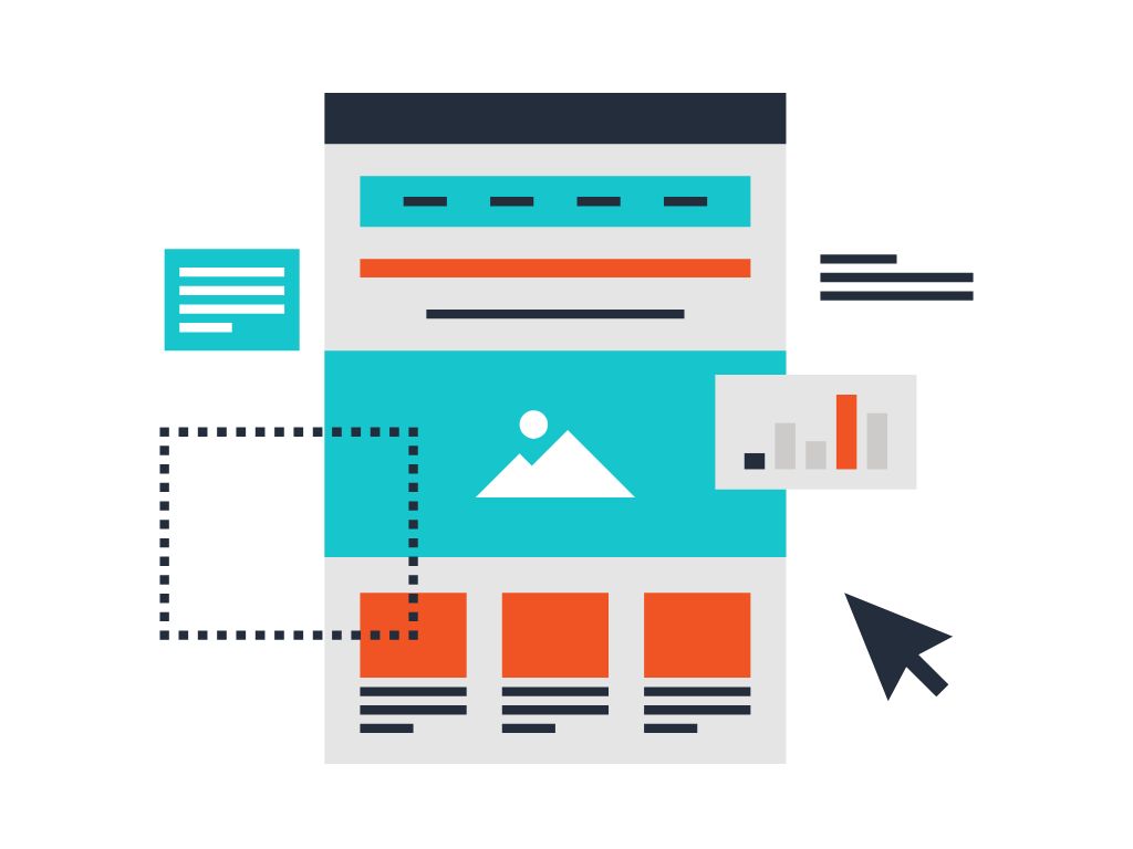
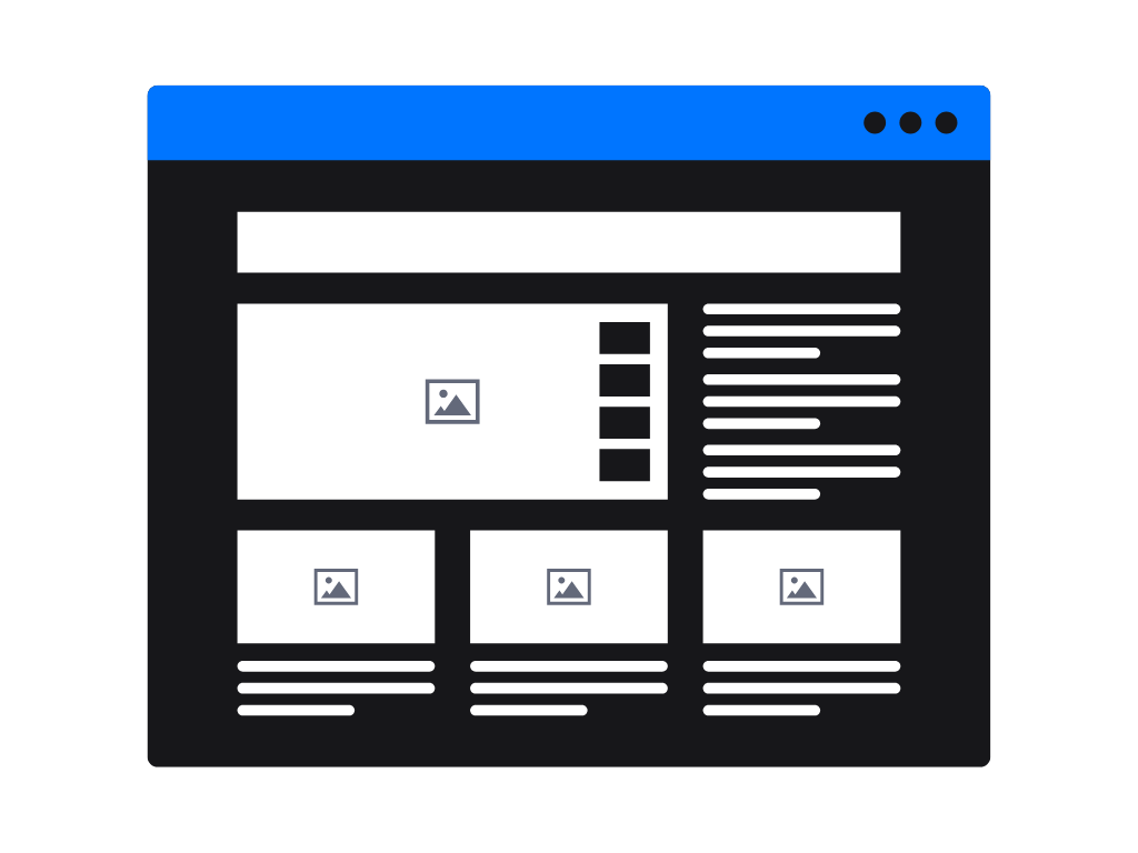
Step 3: Design for Obsession, Not Distraction
The myth? You need flashy graphics, animations, or a designer’s touch to make people convert. The truth is brutal: every extra widget, color, or clever layout you pile on actually kills your conversions. Great landing pages are built for one purpose making it almost impossible not to opt in.
So what does “design for obsession” look like?
Start with ruthless simplicity. Everything on the page should funnel attention toward your offer and the opt-in form. Logo? Shrink it. Navigation? Gone. Social media links? Delete. The more ways you let visitors escape, the more leads you lose.
Color isn’t decoration, it's a weapon. Use bold, high-contrast colors to highlight your call-to-action button and headline. Let the rest fade into the background. The goal is tunnel vision: the only thing that pops should be the next step you want them to take.
Whitespace is your secret weapon. Cramped pages choke conversions. Give your content room to breathe so every section feels effortless to read. If your eye can’t instantly spot the headline, benefit, and CTA, strip it down.
Remove anything that creates friction. That stock photo you love? If it doesn’t directly support your promise, cut it. Testimonials that ramble? Edit down to a single, punchy sentence. Even “helpful” design elements like sliders or pop-ups can distract, not direct.
Your mantra: If it doesn’t make the offer clearer or the opt-in easier, it goes in the trash.
Picture this: a visitor lands on your page and can’t look away from the headline and the promise. Their eyes slide straight to the benefit, straight to the CTA, with nothing to interrupt their flow. That’s how obsession is built. That’s how leads explode.
Step 4: Build Trust With Social Proof and Microcopy
Skepticism is your enemy. Right now, your visitor is asking, “Is this for real? Will it actually work for me? What’s the catch?” Ignore that doubt, and your landing page bleeds potential leads.
So how do you silence the skeptic and make trust feel automatic?
Social proof is your conversion accelerant.
Drop testimonials right where hesitation peaks. But don’t settle for generic praise. Use real names, faces, numbers, and “before/after” specifics. “I got 42 new leads in one day after using this checklist.” That hits harder than, “Loved the freebie!”
Show proof of numbers:
“Join 7,500 marketers already using this template.”
“Downloaded by over 12,000 entrepreneurs.”
Borrow authority: If your freebie has been mentioned in media, display logos: “Featured in [Brand].”
If you have client results or endorsements from industry experts, put those front and center.
Microcopy is your silent persuader.
It’s the tiny text under your form, near the button, or beside the headline that kills doubt before it even forms.
“No spam, ever. Unsubscribe with one click.”
“100% free just enter your best email.”
Button copy matters more than you think: Forget “Submit” or “Download.” Use “Send Me My Free Blueprint” or “Unlock My Checklist Now.”
Speak to the desire, not the task.
Trust is built on frictionless proof: The faster you answer “Is this legit?” the faster they convert. Layer proof and reassurance everywhere they might hesitate.

Step 5: The “Invisible” Opt-In Form: Less Fields, More Emails
You’re this close to the lead, but now comes the silent killer of conversion rates: a bloated, intimidating opt-in form. Most marketers sabotage themselves right here.
They add just “one more” field for better segmentation, or they ask for a phone number they’ll never use. The result? Visitors vanish, leads evaporate.
Here’s the real secret: The most powerful opt-in forms feel frictionless. The visitor barely notices the effort it takes. You want them to glide through, not stop and think.
Cut the fat.
If you absolutely don’t need it, don’t ask for it. In most cases, one field email only is your best friend. Name fields are negotiable, but each extra box drops conversions.
Every field must justify its existence.
Ask yourself: “Will this help me deliver a better experience right now?” If the answer’s no, kill it.
Design for speed and certainty.
Your form should be impossible to miss, but not intimidating. Use bold outlines, plenty of whitespace, and clear, simple microcopy:
“Just your best email below. That’s it.”
“Takes 5 seconds. No credit card. No surprises.”
Signal safety at the point of hesitation.
Under the form, a line like:
“Privacy protected. No spam. Ever.”
removes another block.
Make the submit button a no-brainer.
Don’t settle for “Submit.” Use copy that promises the payoff:
“Send Me the Free Guide”
“Unlock My Cheatsheet”
“Yes, I Want In”
You want your form to feel so lightweight, so low-risk, they’d feel silly not filling it out.
Step 6: The Real CTA How to Make Clicking Feel Irresistible
Most landing pages treat the call-to-action button like an afterthought. They slap “Get Started” or “Submit” on it and pray for clicks. That’s why most CTAs get ignored and why yours is about to get worshipped.
A weak CTA whispers. A strong CTA shouts, seduces, and dares the visitor to say no.
Here’s how you build a button they can’t resist:
1. Make the payoff blindingly obvious.
Your CTA isn’t a step, it's a promise. Tell them exactly what they’re getting the instant they click.
“Send Me the 5-Minute Video Guide”
“Unlock My Instant Access Now”
“Yes, Give Me the Checklist”
2. Create urgency they can feel.
If they wait, they risk missing out. Sprinkle in time-sensitive copy:
“Claim My Free Download Before It’s Gone”
“Get My Bonus Checklist Instantly”
3. Remove every doubt, right at the button.
Position microcopy right below, destroying last-minute hesitation:
“It’s 100% free. No credit card needed.”
“Zero spam. Unsubscribe anytime.”
4. Use bold, high-contrast colors.
Your button must pop off the page. Not blend in. The eyes should snap straight to it, no hunting required.
5. Repeat the core benefit.
The button is your final pitch. Remind them why they came.
“Show Me How to Get More Leads”
“Reveal My Secret Script”
Remember: A button that blends in is invisible. A button that demands action? That’s your conversion machine.
You’re almost at the finish line.
Step 7: Test, Tweak, Repeat How Top Marketers Optimize
Here’s what separates amateurs from rainmakers: top marketers never “set and forget.” They treat every landing page like a living, breathing asset always evolving, always getting sharper. If you’re not testing, you’re guessing. And guesswork costs you leads.
The ugly truth: Most so-called experts launch a page, hope for the best, and never look back. The pros? They run simple, ruthless experiments. The smallest tweaks can spike your opt-in rate sometimes overnight.
Where to start?
A/B test your headline. Swap out curiosity for urgency. Try numbers versus power words. Watch what gets clicked.
Test your offer positioning. Move the key benefit higher. Put the opt-in form above the fold. Flip your social proof from bottom to top or vice versa.
Experiment with your CTA button. Change the color. Rewrite the copy. Try “Unlock My Access” against “Send Me the Free Guide.”
Play with your form fields. Remove the name field. See what happens.
Rotate in fresh testimonials. Sometimes a different story crushes objections your best client case study missed.
The magic is in the numbers.
Set up Google Optimize, Optimizely, or any simple A/B tool. Never assume. Let the data punch you in the face then lean in.
Bonus power move: Obsess over mobile. Half your traffic or more is scrolling on a phone. Test mobile layouts, button sizes, and load times. A single tweak here can double your sign-ups.
One final truth: The most dangerous phrase in digital marketing is “good enough.” Test. Tweak. Repeat. Watch your list explode.

Conclusion: Your Page Is Live Now What?
You’ve built the landing page. The headline grabs. The offer pops. The CTA is impossible to resist. Most would stop here and hope for the best but you know better.
Now, it’s time to feed the machine.
Here’s your next move: Push traffic. Email your list. Drop your link in your social bios. Run a tiny ad campaign. Funnel visitors from every relevant blog post, podcast, and bio you control. Each click is a chance to test, optimize, and multiply your results.
Obsession is the secret ingredient. Every week, check your analytics. Which source brings the hungriest leads? Which step leaks sign-ups? Every stat is a treasure map, follow the trail and tweak what’s weak.
Never let your page rot. The best lead magnets are living, evolving assets. Update your headline. Swap testimonials. Test a new “quick win” every quarter. What works today can work even better tomorrow.
No more passive “set it and forget it.” Treat your landing page like a living sales machine, and it will repay you in sign-ups for years to come.
FAQs: Crushing Objections Before They Kill Your Conversion Rate
What’s the #1 reason my lead magnet landing page isn’t converting?
You’re making the visitor work too hard or your offer just isn’t a “must have.” Clarity, simplicity, and instant value win every time. If your page looks busy, if the offer is vague, or if you ask for too much info, your leads vanish.
Should I use pop-ups or slide-ins to promote my lead magnet?
Only if they support, not sabotage your main offer. Pop-ups can grab attention, but use them sparingly and test everything. If they annoy or distract, you’ll lose trust and sign-ups.
How many fields should my opt-in form have?
The fewer, the better. One field (just email) usually converts best. Only add a name field if you absolutely need it. Every extra field is a barrier.
What tools can I use to build a high-converting landing page fast?
Try Leadpages, Unbounce, Carrd, or even Mailchimp’s built-in landing pages. Don’t obsess over tech. Focus on your offer, copy, and simplicity. Those move the needle most.
How do I know if my landing page is working?
Track conversion rate: visitors divided by opt-ins. 20–30% is solid; over 50% is elite. Test relentlessly. Don’t trust gut feelings let the data decide.
Is it better to send traffic to my homepage or directly to my landing page?
Always send traffic straight to your dedicated landing page. The more focused the experience, the more leads you’ll get. Homepages distract, landing pages convert.
How do I make my lead magnet stand out from competitors?
Get hyper-specific. Promise a faster, easier, or more surprising result. Show real-world proof testimonials, data, or unique “insider” value nobody else is offering.
How often should I update my landing page?
At least quarterly, or every time you spot a drop in conversions. The market shifts, expectations change, and what works today might fall flat tomorrow. Stay obsessed.